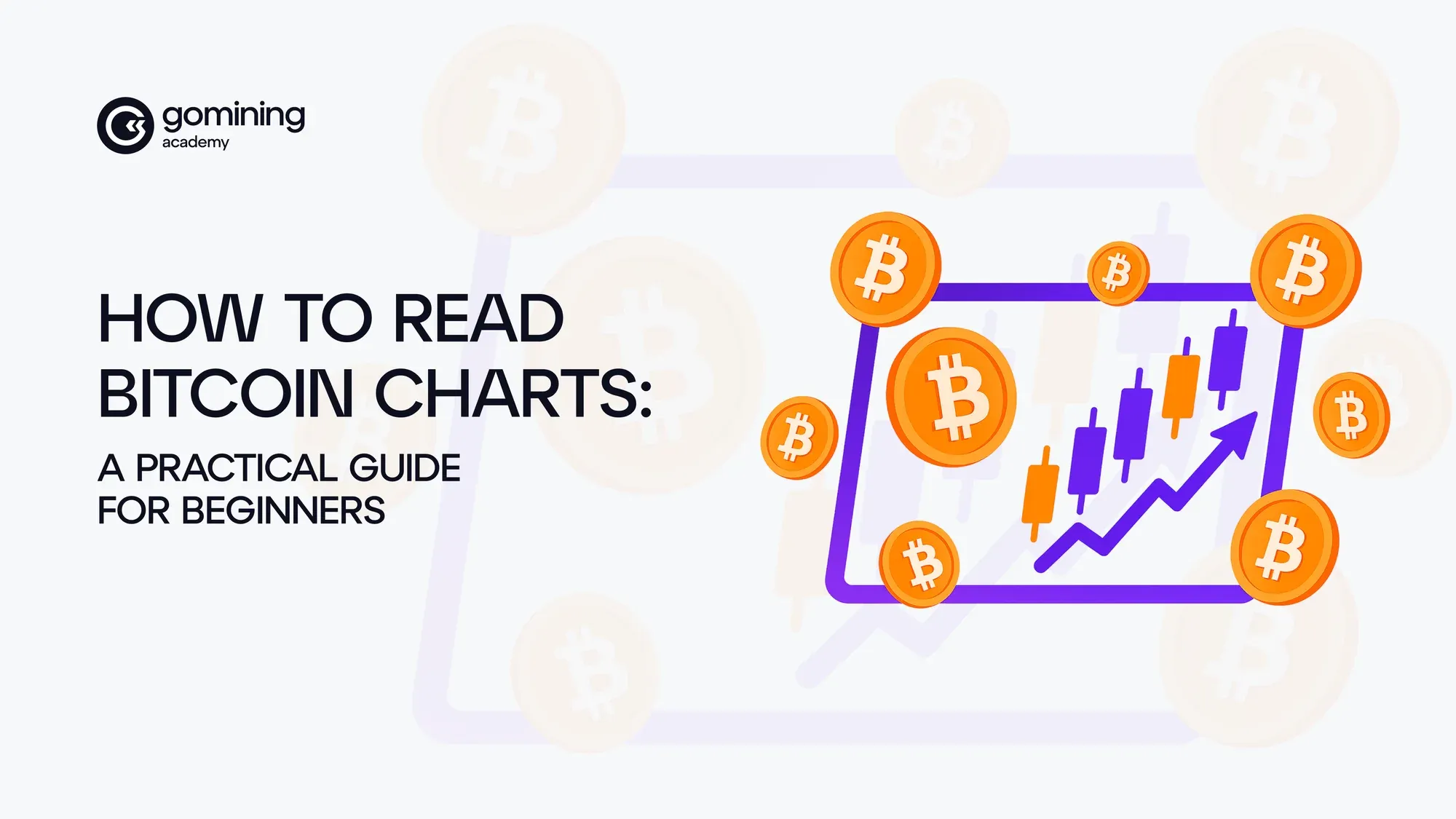
How to Read Bitcoin Charts: A Practical Guide for Beginners
Ever open a Bitcoin chart and feel like you’re staring at modern art?
Colored bars, lines that seem to dance to their own rhythm, and no clue what you’re supposed to be looking at.

Well, you’re not alone. The first time, it looks like chaos. But behind those shapes is a story of what the market’s doing, what traders are feeling, and what might happen next. And the truth is, you don’t need to be a trader, a coder, or a chart wizard to start reading it.
By the end of this guide, you’ll know the basics of how to read Bitcoin charts, spot patterns on crypto charts, and use them to make smarter decisions — whether you’re tracking prices, planning mining upgrades, or just understanding where the market stands.
Let’s dive in.
Table of Contents
- Crypto Charts, What Are You Looking At?
- Crypto Patterns and Indicators: The Secret Language of Chart Analysis
- Avoiding Rookie Mistakes in Crypto Trading Charts
- Your First BTC Analysis Walkthrough: From Chat to Action
- Chart Reading for Miners? More Useful Than You Think
- Charting Your Own Crypto Analysis Path
Crypto Charts:What Are You Looking At?
At first glance, a crypto price chart might look like a jumble of lines and bars fighting for attention. But once you break it down, it’s not as intimidating as it seems.
Here’s a simplified chart snippet:

Here’s what you’re really looking at:
- Axes: The vertical side (Y-axis) shows the price. The horizontal side (X-axis) shows time — seconds, minutes, hours, or days depending on how zoomed in you are. A Bitcoin price chart for the past week might look very different from one showing just the last hour.

From that week, here’s how the price moved in the last hour:

- Candlesticks: These little red or green blocks tell you where the price started, where it ended, and how far it traveled in between during a set time period. Green means price went up, and red means it fell.
- Volume bars: These sit at the bottom of most charts. They show how much Bitcoin (or any crypto) was traded at each moment.
Think of a crypto chart like a weather forecast. The volume bars are your clouds — they show when something big is brewing. A sudden surge? Storm’s coming (or clearing). A breakout above an old high? That’s your sunshine breaking through.
Crypto Patterns and Indicators: The Secret Language of Chart Analysis
Reading a crypto chart is a little like listening to a crowded room. There’s shouting (price), whispers (volume), and moments where everyone goes quiet, right before something big happens.
Welcome to the language of crypto chart patterns and indicators, where the smallest candle can hint at the biggest shift.
Patterns and indicators help you tune in to what’s really going on. And when you start to recognize them, you’ll begin seeing something most beginners miss: what traders are feeling, not just what prices are doing.
Let’s walk through some of them, with a few lessons traders had to learn the hard way.
Some Common Patterns You’ll See Again and Again
Let’s start with a few you’ll spot over and over — and what they’re trying to say.
Doji — When the Market Can’t Decide: This candlestick looks like a plus sign. Price opened and closed in nearly the same spot. That’s the market saying: “I’m undecided.” Dojis often show up when a strong trend is about to pause... or reverse.

One beginner on Reddit spotted a doji forming after a long rally. Their friends were still piling in, convinced the run would continue. But the chart felt off — like the market was taking a breath.
“I didn’t sell, but I stopped adding,” they wrote. “The next morning, Bitcoin dropped 8%.”
Sometimes it’s the simplest pattern that saves you. What would you have done in their shoes?

Hammer — When Buyers Push Back: After a series of red candles, a hammer shows up: small body, long lower wick. It means sellers tried to drag the price lower — but buyers fought back and won.
One trader saw a hammer form at the 200-day moving average, alongside a surge in volume. That was their signal to act.
“A hammer without volume is just decoration,” they wrote. “With volume? It’s a message.” They bought modestly. Bitcoin rallied 15% over the next two weeks.

Engulfing pattern — When Momentum Shifts: Imagine a candle (green or red) so strong it swallows the one before it. It’s the market saying, “I’m taking over.”
If a green candle engulfs a red one, buyers (the Bulls) are taking control.
If a red candle devours a green one, the sellers (the Bears) are back in charge.
These moments don’t happen constantly — but when they do, they’re loud. They usually show up at decision points: the end of a trend, or right before one begins.
These are just a few patterns you’ll start to recognize. There’s a whole charting universe out there — and over time, you’ll figure out which patterns speak clearly to you. Curious to go deeper? You can explore more advanced crypto chart patterns here.
Where You See Patterns Matters More Than What You See
Now what? Should you start hunting patterns up, down and sidelines? Well, no. Something you must understand from the very beginning is that not ALL patterns matter. What matters is where you spot those patterns.
A hammer at random means little. A hammer at a key support level, with high volume? That’s something else. So let’s look at the market’s invisible structure: Support and Resistance Zones.
Support = The Floor
Where price bounces back up, often after buyers step in at a level they see as “cheap enough.” You’ll see multiple touches here like the floor’s been tested but not broken.
Resistance = The Ceiling
Where price keeps getting knocked down, to a level that sellers think is high enough to start taking profits.
When resistance finally breaks, it often becomes a new support. The same goes in reverse. This is called a flip level, and it’s one of the first things that chart readers watch.

See those repeated bounces off support and knock-downs at resistance? That’s not coincidence, it’s memory. Traders remember these zones. And when resistance finally breaks? Watch that flip — it becomes the new floor.
How Traders Actually Use These Zones
Support and resistance aren’t just lines (more like zones) — they’re where traders make decisions.
Spotting reversals:If price keeps bouncing off the same support level, it’s often a sign buyers are stepping in. But when it can’t push past resistance after multiple tries? That’s a warning that a downtrend might be coming.
Strategy moments:Say Bitcoin forms a double top — two peaks, with a low between them. If price breaks below that low (called the “neckline”), many traders see it as a bearish sign and may enter short positions or reduce exposure.
What would you do if BTC kept tapping resistance at a certain price but couldn’t break through? Would you chase, wait, or plan for a pullback?
Indicators: The Extra Clues
- RSI (Relative Strength Index) — Tells you if Bitcoin is looking overbought (price too high?) or oversold (too cheap?). It’s like a mood check for the market, measuring whether it might be overheated or under-loved.
- Above 70 = possibly overbought
- Below 30 = potentially oversold

RSI doesn’t lie: When it dipped below 30, the market was oversold, and buyers stepped in. When it crossed above 70, things got overheated — and the price cooled off fast. RSI is like a pulse check for market emotion.
- Bollinger Bands — The invisible and flexible rails for price. When the price hugs the outer bands, it could mean it’s stretched too far and ready to snap back.
- Tight bands? A big move might be brewing.
- Wide bands? Watch for snapbacks.

Bollinger Bands in action: Notice how price often reverses after touching the upper or lower band. Those outer lines act like elastic limits — when stretched too far, a snapback is likely.
- Volume profile (a hidden gem) — Most beginners overlook this one. Instead of showing trading volume over time, it shows volume at each price level. These high-volume zones often act like magnetic fields — they attract price, or repel it. In other words, Where were the most people buying and selling?

Volume tells the story behind the candles: Notice how price reversals often follow major spikes. Green = strong buyer interest. Red = intense selling pressure. Don’t just watch the price — listen to the volume.
Your First BTC Analysis Walkthrough: From Chart to Action
You’ve discovered the basics. Now here’s where it clicks — when price, volume, and psychology show up all at once on a real Bitcoin chart.
Take a look at the one below 👇

Don’t rush. Just… notice. What stands out?
- That spot where the price dropped twice, then bounced?
- A strange cluster of green volume bars, right as momentum shifted?
- Or maybe that moment the RSI crawled out of the purple zone — like something was waking up?
Whatever grabbed you first… hold on to that. Guess what? You’re already doing chart analysis — right now.
Now let’s decode it — together.
A Double Bottom No One Could Miss: Back in mid-March, BTC slammed into the same level twice and reversed hard both times. That’s what traders call a double bottom, and it’s not random. It usually means buyers saw the same thing you just did: “We’ve been here before — and it didn’t break.” Support held.
Volume Didn’t Whisper — It Roared: Now look at those tall green bars under the bounce. That’s volume, and it’s loud. Price can fake people out, but volume doesn’t lie. When it spikes as price reverses, it’s usually not retail traders. It’s big money. If you learn to read it early? You’ll start noticing these moments before the candles confirm anything.
RSI Was Oversold…but… Look at the RSI line — dipping under 30 just before the reversal. That’s a classic oversold signal, right? But this one’s different. Because it came with volume, and at support. That combo is rare. And powerful. If you don’t see volume + structure, wait. Then came the bounce, and for those who entered, it worked.
The Climb that Followed Wasn’t Just Recovery: From that bounce, BTC started building structure: Higher highs, the RSI rising cleanly, and volume calmed — but stayed healthy. If you’d looked only at price? You might’ve hesitated. But combine the clues?Support + volume spike + RSI breakout = a clear story unfolding. And yes, this particular story ended with Bitcoin hitting new all-time highs.
Avoiding Rookie Mistakes in Crypto Trading Charts
Crypto trading charts aren’t just full of signals — they’re full of traps. Especially if you’re new, it’s easy to feel like you're doing everything right… and still end up making the same mistakes others learned the hard way.
Let’s walk through five common missteps — and how to dodge them.
The “Spaghetti Chart” Problem
You open your chart and start adding indicators because it feels smart. RSI, Bollinger Bands, two trendlines for good measure — maybe one more moving average for luck? Suddenly, you can’t even see the price.
Like one beginner on Reddit who missed a clean bounce at support because their chart was so cluttered and full of details, they couldn’t find the road.
Clutter is usually a sign of doubt. When you don’t trust your instincts, you reach for more tools. But more tools don’t equal better decisions — they just create noise.
Simple charts = sharper reads. Start with price, volume, and one or two trusted indicators. Clean chart. Clear head.
Ignoring Volume
Volume is one of the most underused clues in technical analysis, especially by beginners. They see a breakout and rush in, without asking: “Is anyone else actually trading this?”
Price without volume is like applause in an empty room. It might echo, but there’s no crowd behind it. Volume helps you filter noise from conviction.
Are price and volume rising? That’s a crowd move.Did price move without volume? Be careful. It might be a dilution.
When Emotion Leads the Trade
Ever bought a coin because everyone was posting rocket emojis and shouting “next leg up”? Only to watch it dump 20% the next day? That’s not just bad timing. That’s FOMO (fear of missing out) — and it’s one of the most expensive habits a trader can build.
Charts might look mathematical. But under every line, wick, and level is emotion — memory, fear, confidence, greed. Support isn’t a magic number; it’s a place where people remember what happened last time.
Every price move is a human pattern playing out.
If you don’t know how you react to uncertainty — if you chase green candles or freeze when it drops — no indicator will save you. That’s why the best traders spend more time managing their mindset than tweaking their charts.
Trying to get better at this? Start by knowing when you feel impulsive. Then do nothing until that feeling passes.
Skipping the Headlines
You’ve got the perfect setup — clean trendline break, RSI confirmation, volume spike. You’re ready. Then a surprise Fed hike hits. Or a major exchange pauses withdrawals. The chart didn’t see it coming. And now it doesn’t matter because you’ve learned: Chart reading ≠ news blindness.
- Technical analysis tells you what traders are doing.
- Fundamental analysis hints at why they might stop.
You don’t need to chase every headline. But you do need to stay alert to the ones that move the market.
Chart Reading for Miners? More Useful Than You Think
Most beginners assume Bitcoin charts are just for traders and that price charts are their compass. But what if you mine? Would a price chart still matter?
Let’s test it:
👉 If Bitcoin is climbing steadily, would you upgrade your mining rig now… or wait? 👉 If price just dropped below support with no volume, would you reinvest… or hold rewards?
See? You’re already thinking like a strategic miner. And that’s where chart reading comes in — not for guesswork, but for planning like a miner.
On Reddit, one miner shared how they use RSI and volume to time hardware upgrades. Not to trade — but to act before difficulty adjusts. They weren’t guessing but reading the room.
Why Timing Matters So Much
Mining isn’t passive. It moves with the market. Charts help you spot three things most beginners miss:
Upgrade Window: Miners don’t just buy hardware when they have money — they time it. If price is low but volume is rising, miners call that a sweet spot — before hardware demand (and prices) jump.
Profit Shifts: Price leads the hashrate. Always. A miner who watches charts might spot profitability shifts before the difficulty changes and be ready.
Avoiding Mistakes: Buying equipment when the price is peaking? That’s how some miners ended up with 5-year payouts. Others waited for better entries, often by watching the same charts traders use.
You don’t need to trade Bitcoin and predict the future. You just need to see the signs before they become headlines.
Charting Your Own Crypto Analysis Path
You’ve seen the patterns. Walked through a real BTC chart. Practiced reading support, volume, and signals in context.
So… what comes next?
If you had one chart, 30 seconds, and one choice — buy, sell, or hold — what would you check first?
Support? RSI? Volume?
The answer will change in time. That’s the point. What matters is that you have a process. And the more charts you read, the sharper it gets.
Think back to the stories you just read. Not one of those traders got it right every time. What was the difference? They spotted something early, and they listened. They made one small decision — to trust a chart, pause before buying, and notice something others missed — and that’s what made the difference.
Chart reading isn’t about being perfect. It’s about getting better at noticing what matters.
Next time you’re about to buy a rig, or reinvest rewards… stop. Pull up a btc price chart. What do you see?
Now guess: Is this a good time to act… or wait?
Ten seconds of chart reading could save you weeks of regret. Or unlock rewards you didn’t even know you were missing.
Where to explore next:
- Use our crypto mining calculator to test how price shifts affect your strategy.
- Browse the GoMining collections to see how real BTC price action connects to mining.
- Curious about what’s next? Dive into AI Bitcoin mining, or how to mine Bitcoin.